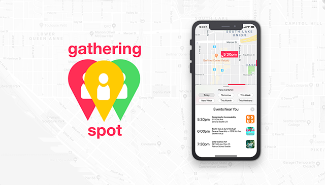
Gathering Spot
Mobile App Hackathon
Project Overview
The theme of the hackathon was "For Students, By Students." As recent bootcamp graduates, we decided to design and build a mobile app that other bootcamp students and graduates could use to find networking events nearby through the use of a map.
Duration: Two Days.
Team members:
- UX Design — Nate Folsom (me), Amber Barney-Nivon
- Software Engineering — Nathan Page, Nathaniel Dominguez
- Data Science — David Elliot, Derek Steffan
Project Planning
After deciding on the topic of our project, we discussed features and what would be feasible for the developers to accomplish over the course of the two days.
Between the two UX designers, we divided up responsibilities for the project. I would be responsible for interaction design and final mockups, while Amber took charge of user research and graphic design of screen elements.
Whiteboarding
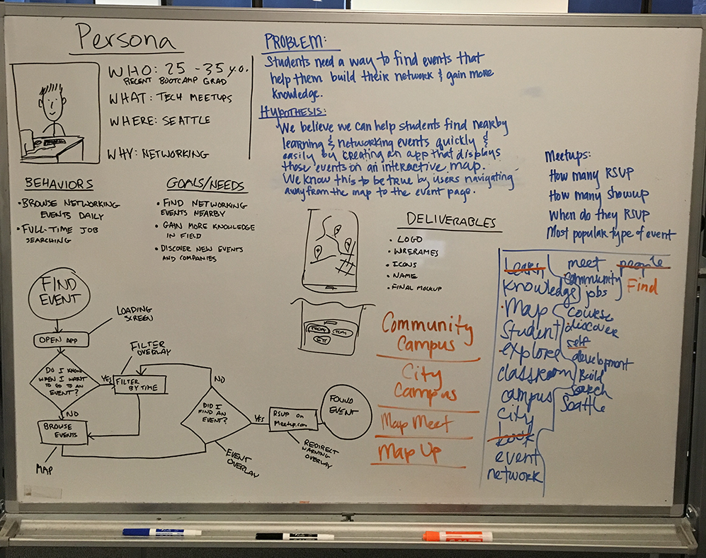
Before splitting up to work on our respective deliverables, we planned everything out on a whiteboard to make sure we were on the same page.
After quickly sketching out a persona, user flow, wireframe, and hypothesis we got into research and design.
Research
While Amber researched event attendance statistics, I took a look at other mobile apps that use maps.
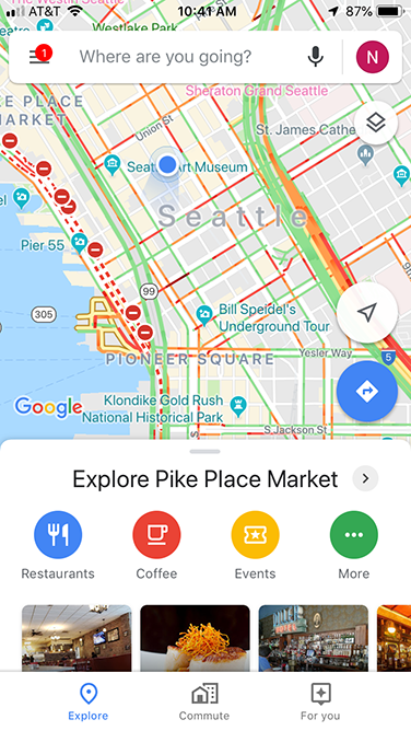
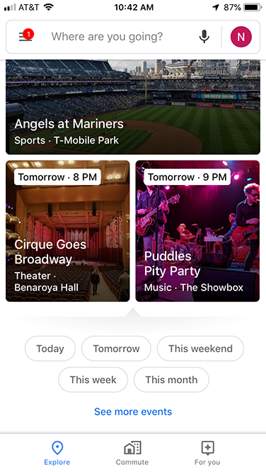
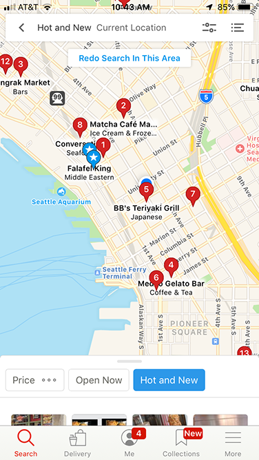
By using apps such as Google Maps, Facebook Local, Yelp, and Snapchat I was able to identify some key design patterns that our users have come to expect.
Wireframing
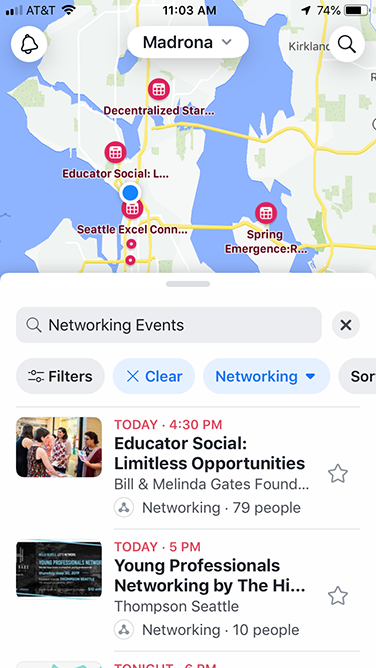
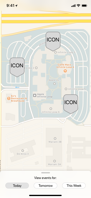
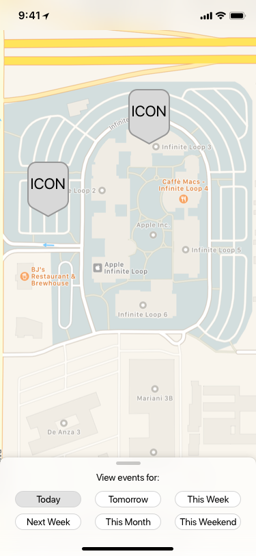
Time was of the essence for this short-term project, so I built a low- fidelity wireframe as quickly as possible. Using an iPhone X UI kit on Sketch, I was able to put it together in a matter of minutes.
Prototyping and Testing
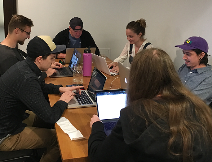
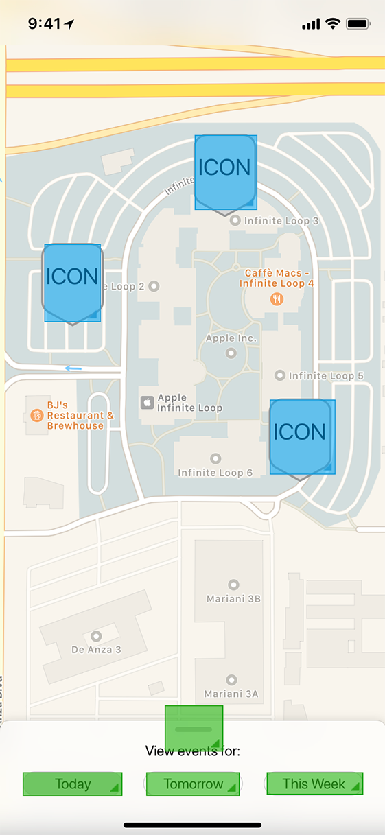
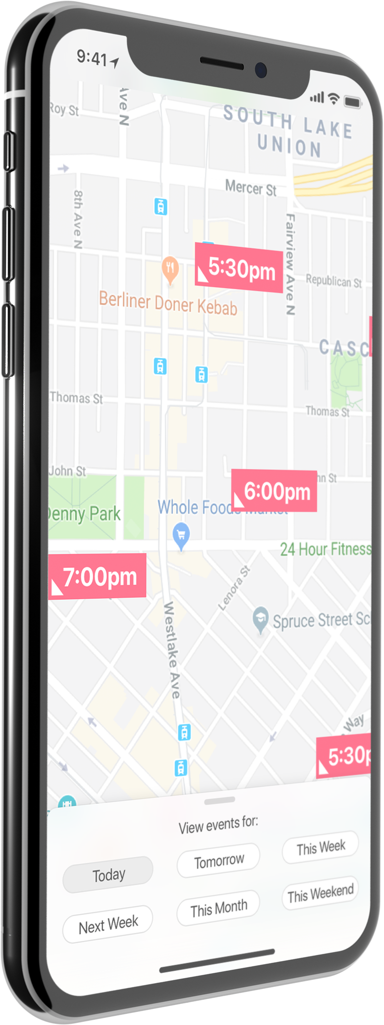
Using my wireframes and InVision, I quickly created a prototype of the app. I was able to snag two passersby for guerilla user testing.
For those unfamiliar with InVision, the screen to the left is shown in "build mode," where hotspots can be added. Blue boxes represent hotspots that are unique to this screen, while the green boxes are added using a template that can be applied to multiple screens.
Test Results
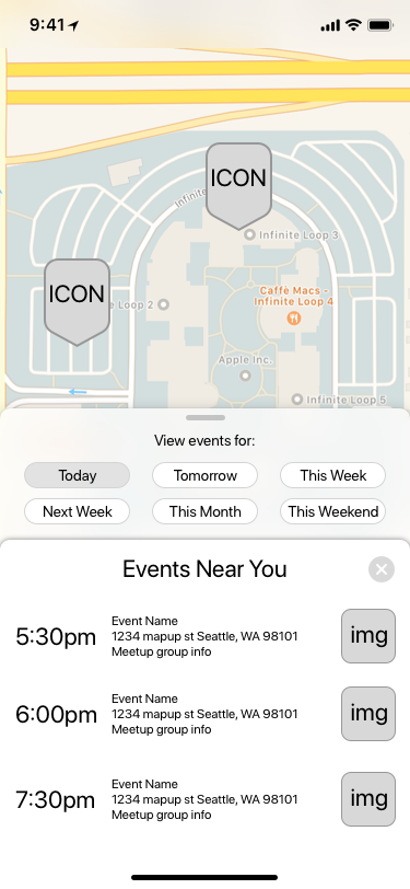
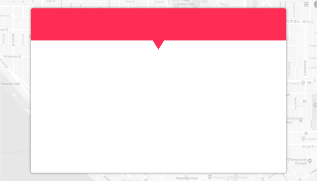
During testing I discovered a design pattern that I had missed in my initial wireframes. My users were expecting to see a list of events when they pulled up on the filter overlay. However in my initial design the only way to see event details was to tap on the map.
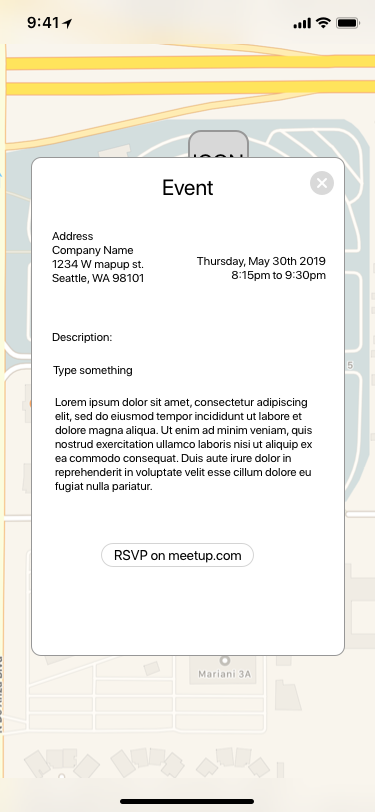
After correcting the issue, I was ready to get graphic design assets from Amber and put together hi-fidelity mockups
Presentation Slides
To wrap things up, I put together a few different formats of slides that the whole team could use to present our progress and app concept at the end of the second day.